

Table of Contents
Gestalt principles in UI design
Negative space has always been a staple of good design. Leaving white around elements in our designs is probably the first thing that comes to mind, but then there are those where you can see an arrow hidden between E and X just waiting for its moment at center stage!
Applying the principles of psychology will help you create more successful designs. This story is about how to use human-centric design, a technique that humans are at its center and every part grows from their needs or desires; this means we should focus on what they care most about when designing our products for them! In addition, learning some theory behind these concepts too so, there’s no room left to imagine someone else looking back wondering why didn’t know.
Similarity
Grouping similar elements together can be an effective way of organizing the design. The human mind loves groupings, and will often find patterns where none exist if given sufficient time to savor their finding!
This is especially true when the similarity between items in each grouping offers clues about how they relate–such as color schemes or shapes that form calming/ Majestic figures on paper.
One of the best ways to stand out from your competition is by using different buttons, graphics, or other elements on each page. This will help draw attention and make it easier for people who are browsing through sites with similar offerings to understand which one they want!
In UI design, using similarity makes it clear to your visitors which items are alike. For example, in a features list using repetitive design elements (such as an icon accompanied by 3-4 lines of text), the similarity principle would make it easy to scan through them. In contrast, changing the design elements for features you want to highlight makes them stand out and gives them more importance in the visitor’s perception.
Continuation
The law of continuity posits that human eyes will follow the smoothest path when viewing lines, regardless if they were originally drawn in a straight line or not. This means you can use this to your advantage and guide visitors around on pages with important information by making sure it’s positioned accordingly for them!
Since the eye naturally follows a line, placing items in a series in a line will naturally draw the eye from one item to the next. Horizontal sliders are one such example, as are related product listings on sites like Amazon.
You may like: UI Design Trends 2023
Closure
The closure is one of the coolest gestalt design principles and one I already touched on at the beginning of this piece. It’s the idea that your brain will fill in the missing parts of a design or image to create a whole.
In its simplest form, the principle of closure allows your eye to follow something like a dotted line to its end. But more complex applications are often seen in logos, like that for the World Wildlife Fund. Large chunks of the outline for the panda are missing, but your brain has no problem filling in the missing sections to see the whole animal.
The way that you use closure in UI design can have a big impact on the user experience. One such example is when an image fades away to show more content, which makes your site seem less cluttered because it gives people the confidence they will find what’s right for them if continue scrolling or looking through further posts (and also helps reduce bounce rates).
Proximity
Proximity refers to how close elements are to one another. The strongest proximity relationships are those between overlapping subjects, but just grouping objects into a single area can also have a strong proximity effect.
The opposite is also true, of course. By putting space between elements, you can add separation even when their other characteristics are the same.
Grouping certain things without the use of borders is a common technique used in UI design. This process makes it easy for viewers to pick up on your organization and structure by grouping similar items closely with space in between each group, leading them towards perceiving what you want them to!
Figure/Ground
The figure-ground principle is a cool way for you to take advantage of your brain’s processing skills. You’ve probably seen this in memes on social media or as part of logos (like FedEx), but what exactly does it mean? Well, let me show ya!
The term “figure” refers not only to people imagery such as portraits where there’s an emphasis placed upon them – which would make sense if we’re talking art history 101–but also things like landscapes that have flat surfaces with little detail; these can serve much simpler functions than figures do…though sometimes they may share similar attributes too.
For example, when you look at a picture of your family in the typical Western world we see them as separate individuals with their own sets of facial features. However, if they were all huddled together on one side or another then it would be harder for our eyes to distinguish who was who because everything seemed similar looking so close up!
It turns out that this works similarly within images – objects considered “foreground” will typically stand out from background clutter while those behind serve only ornamental purposes (like providing cover).
You may like: Why UX Writing Is Important And What Are Examples?
Symmetry and Order
The law of symmetry and order can be referred to as prägnanz, the German word for “good figure.” It says that your brain will perceive an image in as simple a manner as possible–and if you’re trying not only to catch its attention but also make it understand what emotion or feeling you want to communicate with this piece then keep things tidy! For example, A monochrome version Olympic logo seen is made up of overlapping circles rather than curved lines which makes sense because we see more shapes these days so there needs less explanation on how everything fits together from the left top right bottom front back.
Common Fate
Common fate or Schismatrix as it’s sometimes known has been added to the gestalt theory. This principle enables us in UX design with our understanding of people and their grouping behavior when they come into contact with one another- whether that means moving towards each other (i e cohesive)or away from common directions like toward something blue!
Movements and actions of individual elements within a flock or school create the illusion that they are acting as one.
This is a very useful technique for designers who want to create the illusion of movement in their designs. Not only does it work with moving elements, but you can also use this principle without any actual animation by simply giving certain parts an airy or ghostly feel that suggests they’re flying through space!
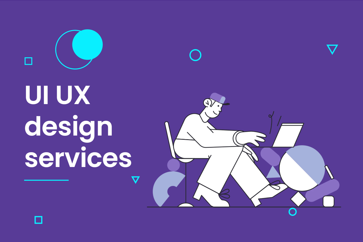
Ui UX design services
Our Ui UX design services help you improve your user’s experience and let them enjoy checking out your website or application. We help make your interfaces more user-friendly and efficient. UI/UX design services can also help you gather valuable feedback from customers to improve your product or service.


