


if you do work for a company you will need a clear relationship with your Colleague you will need an organizational chart to have a clear relationship between levels and units.
so I collect information about the organization chart in this blog.
Table of Contents
What is an org chart?
An org chart is a graphical representation of an organization’s structure. It shows the relationships between different levels and units within the organization. Usually, org charts are used to depict hierarchical relationships, such as those between a company’s CEO and its various departments.
Why is an org chart important?
An org chart is important because it shows the relationships between different levels and units within an organization. This can be helpful for communication and planning purposes. org charts can also be used to depict complex relationships in a simple and easy-to-understand way.
How to create an organization chart in PowerPoint?
To create an org chart in PowerPoint, you will need to add shapes to the slide and then connect them to depict the different levels and units of the organization. You can also add text to the org chart to label the different elements.
org charts are a valuable tool for businesses of all sizes. They can help with communication and planning and can be used to depict complex relationships in a simple and easy-to-understand way.
Also read: How To Make A Quiz In PowerPoint?
10 pros and cons of creating an organization chart in PowerPoint.with an explanation for each of them:
Pros:
1. Helps with communication and planning
2. Can be used to depict complex relationships in a simple way
3. Makes it easy to understand the different levels and units within an organization
4. Can be used to find potential problems or areas of improvement within the organization
5. Can help new employees orient themselves within the organization
6. Can be used as a training tool for new employees
7. Can be used to evaluate employee performance
8. Can help identify areas where additional resources are needed
9. Can be used to track organizational changes over time
10. Org charts can be easily updated and shared electronically
Cons:
1. Creating an org chart can be time-consuming
2. It can be difficult to keep the org chart up-to-date as the organization changes
3. Org charts can become outdated quickly if they are not regularly updated
4. They can be difficult to understand if they are too complex
5. Some people may find org charts intimidating or confusing
6. They can give the impression that the organization is more hierarchical than it is
7. Org charts can be used to promote nepotism or favoritism within the organization
8. They can be used to unfairly evaluate employees
9. Org charts can be used to justify downsizing or layoffs
10. They can create a false sense of security within the organization

How to create a better organizational chart?
There are a few ways to create a better organizational chart:
1. Keep it simple – don’t make the org chart too complex or difficult to understand.
2. Use colors and labels – use colors and labels to help distinguish different levels and units within the organization.
3. Update regularly – keep the org chart up-to-date by regularly updating it as the organization changes.
4. Get input from employees – get input from employees when creating the org chart to ensure accuracy and buy-in.
5. Use different views – use different views (e.g. top-down, bottom-up) of the org chart to depict different relationships.
6. Create multiple org charts – create multiple org charts to depict different aspects of the organization (e.g. structure, function, location).
7. Use software – various software programs can be used to create org charts (e.g. Microsoft PowerPoint, Visio, Lucidchart).
8. Hire a professional – if you’re not sure how to create an org chart, you can hire a professional to do it for you.
9. Be creative – don’t be afraid to be creative when creating your org chart.
10. Have fun – remember, org charts don’t have to be boring! Have fun with it and make it your own.
Also read: How To Work With Tables, Graphs, And Charts In PowerPoint
How to create a better organizational chart with vannage?
Making PowerPoint organizational charts in Venngage is a seamless process. The platform’s templates are designed by experts for non-designers, like the example below:
You don’t need to download any software to use the Venngage editor because it’s available online. You can register for free and begin creating immediately.
To make an organization chart on Venngage, follow these simple steps below:
1. Create an organizational chart
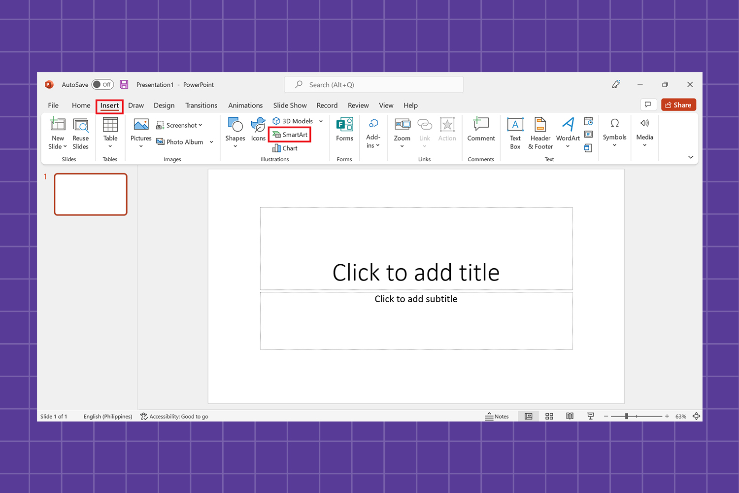
Open a blank document in Microsoft PowerPoint and click SmartArt under the Design tab.
You should see a popup window where you can select a SmartArt graphic. There are several templates to pick from under Hierarchy.

2. Change the font style and size
Large sans serif fonts are commonly used because they are supposed to be read by everyone. If your org chart becomes too crowded, you may need to reduce the font size of some names while keeping legibility.

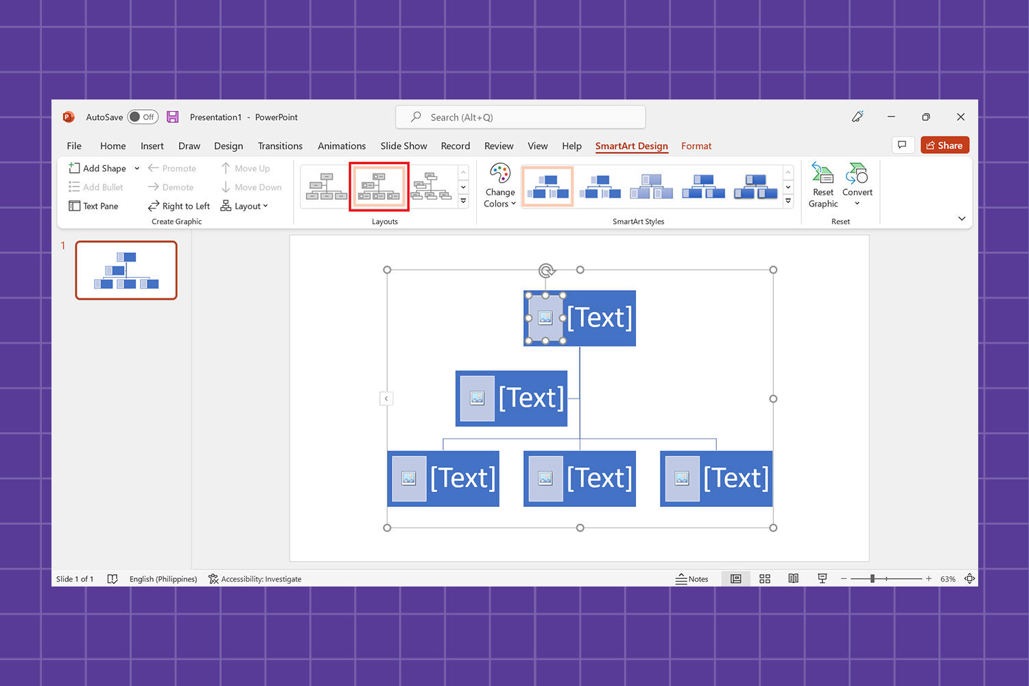
3. Edit the organization chart
The SmartArt Design tab gives you options to insert a new shape or add more shapes, alter the title position, font color, and name order, among other things.
4. Insert pictures or icons into an org chart in PowerPoint
SmartArt Design also has a layout that allows you to put pictures or icons in your organization chart.
If there are any corporations engaged, you may include their logos right next to their names. Corporate logos are one of the most significant parts of org charts since they make them look more professional.

Upgrade to a Venngage for a Business account to access My Brand Kit, which lets you add your company’s logo, color palette, and fonts to all your designs with a single click.
A business account also includes the real-time collaboration feature, so you can invite members of your team to work simultaneously on a project.
Now that you know how to create an organizational chart in PowerPoint, start creating an org chart with these templates.

How to make an organizational chart for PowerPoint in Venngage
Venngage allows you to download your new chart with an upgraded account.
Once you are done creating your chart, save the file on your computer by clicking Download in the menu. You can choose from a variety of download formats, including PNG, PNG HD, PDF, or an Interactive PDF.
You can also export your chart as a PowerPoint presentation.
Make better org charts with Venngage templates
An org chart is a simple yet effective tool for understanding your company’s structure and improving your growth potential.
It will also provide more accurate reporting and clarity on who is responsible for what, allowing for quicker decision-making.
While Microsoft PowerPoint provides basic presentation resources, Venngage has a far larger library of templates and features, including a plethora of free icons and fonts, as well as a user-friendly interface that even permits real-time collaboration.

How to make an org chart in the lucid chart?
There are a few steps to follow when creating an org chart in Lucidchart: 1. Sign up for a free Lucidchart account or log in if you already have one. 2. Select the “Org Chart” template from the template library. 3. Add your employees’ names and job titles to the org chart. 4. Connect the different levels of the organization using lines and arrows. 5. Use colors and labels to distinguish different units within the organization. 6. Save and share your org chart with others.
7. Update your org chart regularly as the organization changes. 8. Use different views of the org chart to depict different relationships. 9. Create multiple org charts to depict different aspects of the organization (e.g. structure, function, location). 10. Have fun with it! Org charts don’t have to be boring. Make yours unique and reflect your company’s culture.
Tips for creating an organization chart for PowerPoint.
tips for creating an organization chart in PowerPoint?
1. Use basic shapes: It is recommended to use basic shapes when creating an org chart in PowerPoint. This will help to ensure that the chart is easy to understand and follow.
2. Connect the different levels: Use lines and arrows to connect the different levels of the organization.
3. Use colors and labels: Use colors and labels to distinguish different units within the organization.
4. Update regularly: Update your org chart regularly as the organization changes.
5. Use different views: Use different views of the org chart to depict different relationships.
6. Create multiple org charts: Create multiple org charts to depict different aspects of the organization (e.g. structure, function, location).
7. Have fun with it!: Org charts don’t have to be boring. Make yours unique and reflect your company’s culture.
3 key benefits of an org chart:
- An organization chart template helps new hires get to know fellow employees. They learn who owns which areas, who the senior staff members are, and the types of departments that exist within the organization. More importantly, they understand how their role fits into the current organizational structure.
- An organizational chart helps people understand how changes within a company impact them. As organizations grow or downsize, people are promoted, moved to different teams/departments, or asked to report to new executives, and so on. A business organizational chart reflects these changes in leadership, team responsibilities, and who everyone reports.
- An organizational chart is a great way to communicate your brand. Organizational charts today are designed to demonstrate an organization’s values and philosophies. The organization’s stance on hierarchy, collaboration, inclusivity, and other concepts are visualized here.

What are the different types of organizational charts?
There are different types of organizational charts, and the type that you use will depend on the needs of your organization. The most common types of org charts are hierarchical, matrix, and flat.
Hierarchical: A hierarchical org chart is the most traditional type of org chart. It is used to show the different levels of management within an organization, as well as the different departments within each level.
Matrix: A matrix org chart is used to show the different projects or teams within an organization, as well as the different people who are working on each project or team.
Flat: A flat org chart is used to show all the employees of an organization in one single view. This type of org chart is usually used in small organizations.
What are the different parts of an org chart?
The different parts of an org chart include the following:
– The organizational name and logo: This is typically placed at the top of the org chart.
– The title: The title is typically placed below the organizational name and logo, and it indicates what the org chart is showing (e.g. “Organizational Structure” or “Departmental Org Chart”).
– The legend: The legend is used to explain the different colors, symbols, or shapes that are used in the org chart.
– The organizational units: These are the different parts of the organization that are represented in the org chart.
– The lines and arrows: These are used to connect different organizational units in the org chart.
– The footer: The footer typically contains contact information or links to additional resources.
After all, it depends on you and your organization to use an organization chart or not I offer it to you as a way to have more Disciplinein your organization
In the end, if you have any questions and you face a problem in the middle of the process let my
Colleague try their best to solve your problem.

presentation design services :
With our presentation design services, we can help you create an amazing visual representation of your business. They are designed by professional strategists and designers who understand how important it is to have visuals that communicate clearly and effectively while still being aesthetically pleasing. They’re also created using the most up-to-date data so they won’t become obsolete quickly like other types of marketing material might be.


