


We are always searching for ways to improve our presentation and look more professional. Also, we should make a presentation, so our audience understands what we are saying. Charts are one of those top things we can use to make things easier to understand for our audience.
Table of Contents
What is a pie chart?
As you can understand by the name, a pie chart is a kind of visualization that uses a circle to represent the whole. We use the slices of the process, or “pie,” to represent the specific category we want. Also, a pie chart will help us to organize and show data as a percentage of a whole, so it is one of the most important charts.
Why a pie chart?
This kind of chart will help the audience o compare different dimensions so that the users will spend less time comparing more than two items.
When should we use pie charts?
It is essential to know when you can use the pie charts so you can use them at a suitable time.
- When there is no time need
As my first position, I preferred to talk about the clear one. It’s much better to use pie charts when you don’t need to talk about any time. When you need to present time, it will take more work to explain it to your audience with a pie chart.
- When we have Few components
A pie chart works better when you have fewer components cause, in this way, you make things. More clear for your audience.
- When we have Distinct Parts
The aim of using a pie chart is to compare the contribution of each part to the whole data so that it will be easier to reach when we have different characteristics.
Importance of using a Pie Chart in Google Slides
The only thing you should know about pie charts is that there’s no place to be worried because they are available within the chart list in the insert section in Google slides. So you don’t need to worry if you want to use a pie chart, you can easily make it with direct metals, but if you need to customize, resize, or change their data or metrics, there do it or ways that we will teach you in this blog post.
Google slides also provides an option to import the chart from sheets. So you can bring all the charts you are made into sheets, even if they don’t exist in the slides.
How to Make a Pie Chart in Google Slides?
First method:

Step 1:
The first step to the cold direct chart metal I will lend you how to make a pie chart in Google slide, so we going to set up the charts data:

Step 2-
Open a Google Slides file from the house page, or start a clean presentation.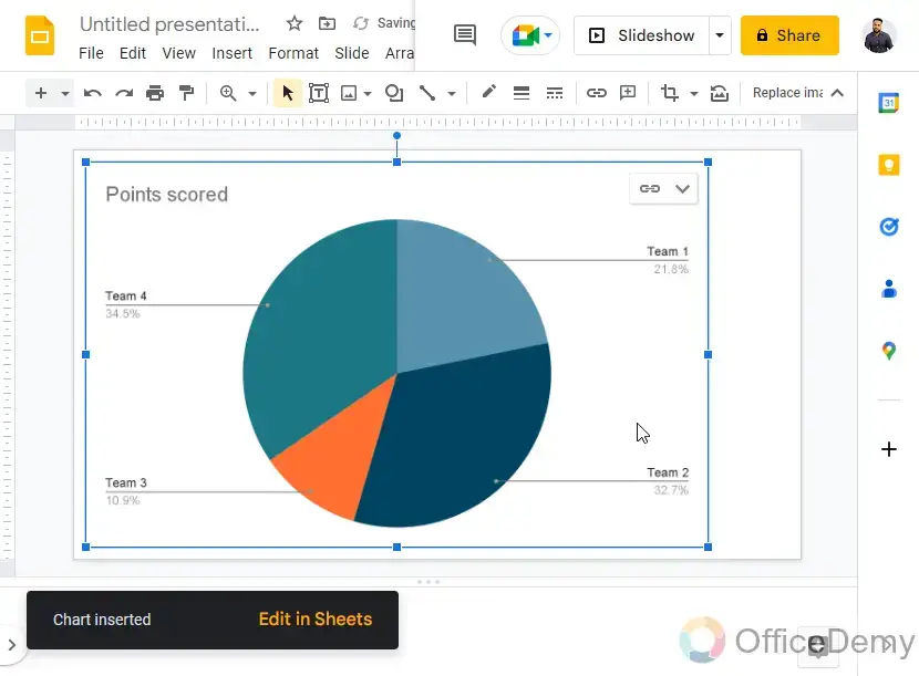
Step 3-
go to Insert > Chart > Pie chart
Step 4-
A template has been introduced with dummy facts.
Here you learn how we make a pie chart in google slides. Still, I know that it could be a little hard for you to use it, or you may not be sure of what exactly you can do with this chart, so in this case, is a recommend you to search for help or in somehow it’s better to work with agencies with similar experiences.
Second method:
I will teach you how to set up chart data in our second step. After making a pie chart in Google slides, read the message I lent you here. Time did you go to the template, and you have a drop-down at the top right side of the chart in which you have an open source option.
For clarity, source means the data source, so with me is that it’s time to put your information and data into your chart in this step:
Step 1-
Click on the “Open source” button inside the chart’s dropdown

Step 2-
A Sheets record opens inside the new tab

Step 3-
They told you that you would see visual allies on your poacher so you could change your data using basic sheets skills.

Step 4-
Here you will see that I change the whole theater, so it looks like a full mini breakdown of data. So here you can see the details, and you can use them efficiently.

Step 5-
Bing oldies, you should know that you can place your chart anywhere on the page, which is made to have fewer distractions. You detailed it, and I don’t know if you want to add some references or something like that.

Step 6-
Now returned to the Slides, you may see a “replace” button appearing at the pinnacle. Click on it to replace the chart’s data.

Step 7-
No, your chart is updated, and he sees your final project. Honestly, I know that it can be sometimes hard for us to customize them in our presentations mostly and people who have read my recent blogs know that I always recommend to people that have an essential presentation to work with some agencies that have similar experiences and for dad always tells them to go and see their portfolio they recent projects and then trust them.

Using shapes:
What is the most stunning vase for making a chart is which shapes call dad. Sometimes that we don’t need a data chart. We need an empty pie chart template that can be used for printing or showing in the class or changing our requirements for our requirements at different times.
So here I will teach you how to make a pie chart in Google slide using shapes. You should know that these charts do not contain any data on the bus, so where is neurologic for colors and the number of slices of the world is fully manual NV how to draw the segments between the pieces.
Step 1-
go to Shapes > Shapes > Pie
Step 2-
Draw the Pie on your Slide
Step 3-
Now you can see there may be a space from which the slice is clipped, you can hold it as it’s far in case you need it, or you may boom or lower the dimensions of the clipped vicinity using the curves handle and anchor factors on the edges.
Step 4-
If you want to feature some other slice to fill this hole, you could reproduce the general form > paste it, and then rotate it to mirror the antique structure.
Step 5-
Now you may trade the color of any of the shapes you need to reveal with some other color.


Ui UX design services
Our Ui UX design services help you improve your user’s experience and let them enjoy checking out your website or application. We help make your interfaces more user-friendly and efficient. UI/UX design services can also help you gather valuable feedback from customers to improve your product or service.


