


When choosing a font to use for your logo, it’s important that you choose one with striking or unique qualities so people will notice and remember your brand.
As the first thing they see when looking at any company’s branding materials (fonts being an integral part), this could not be more true!
So, how do you choose the right logo font? Here are a few tips:
1. Consider your brand identity. What kind of feeling do you want your logo to convey? For example, if you’re a fun and friendly brand, you might want to choose a playful font. If you’re a more serious or formal brand, you might want to choose a classic serif font.
2. Keep it simple. A logo should be easy to read, so avoid overly complicated or ornate fonts.
3. Consider the overall design of your logo. The font should complement the overall aesthetic, so it’s important to consider things like color and spacing when choosing a logo font.
4. Make sure the font is legible in different sizes. Your logo will be used in a variety of different contexts, so it’s important to make sure the font is legible at both small and large sizes.
5. Consider using a unique or custom logo font. A unique font can help your logo stand out from the crowd. However, be sure to use a custom font sparingly, as it can be difficult to read.

Table of Contents
How to select the perfect logo fonts
When choosing the right font for your next logo, consider what kind of brand identity and overall feel you want. Keep it simple yet legible so that people can easily understand everything about your company with just one glance at its design!
you may like: A Beginner’s Guide To Creating Cartoons

Serif logo fonts
These logo fonts convey a feeling of tradition, stability, and elegance.

Sans-serif logo fonts
These logo fonts are modern, clean, and minimalistic.

Script logo fonts
These logo fonts are often playful and evoke a sense of luxury.

Display logo fonts
These logo fonts are eye-catching and often unique or custom.

How many fonts should you use in a logo?
You can choose to use one or two fonts in your logo, but it’s important that you pair them carefully so as not to overwhelm the design. For example: if an industrial style is desired then consider pairing this with either script typeface for added legibility during viewing from afar versus something more intricate like lettering made out of wood panels which would only be readable up close due to their small size (especially since most people will never get near enough).

How to combine logo fonts?
To make sure your logo is legible, you should consider the typefaces that are paired together. For example if one has sharp edges while another has round ones will help create contrast and thus be easier on viewers’ eyes – this way they can tell what’s being communicated more easily!
you may like: How To Animate A Storyboard Logo: The Easy Way
Here are the top logo fonts everyone should know:
– Arial
– Helvetica
– Times New Roman
– Georgia
– Verdana
– Courier New
– Trebuchet MS
These logo fonts are all classic, legible, and versatile. They can be used for a variety of different logo designs.
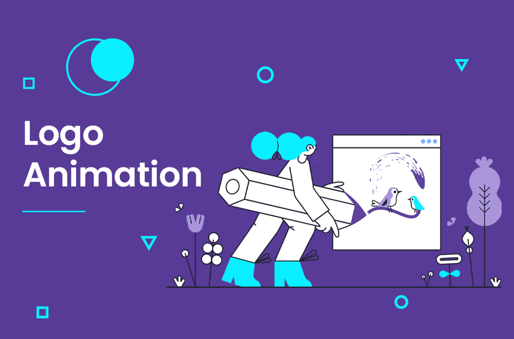
logo animation
Logo animation is a short video that loops smoothly and shows the features of your business, product, or service. A logo animation will boost brand awareness and clicks on the items included. We can consist of catchy visuals, colors, text, and audio. We design a logo animation that will suit your business.
do you need Logo animation service? Contact Us NOW!


