Color talks! Remember, when you see a color that reminds you of a particular brand, that’s how color talks with you. Many people think the choice of UI colors mostly depends on the UI designer’s taste and sense of beauty.
The process of choosing color is based on color theory in UI design. Color is one of the essential characteristics of every design, along with other characteristics such as typography, space, etc., and color combination matter.
You need to know how colors relate to one another to create good UI&UX design services. That’s why students at art schools, colleges, and universities study the science of color theory devoted to colors’ nature. In this article, you will learn about the basics of color theory and the color combination that can be effectively applied in your UI design-creating process.
Table of Contents
Color Theory
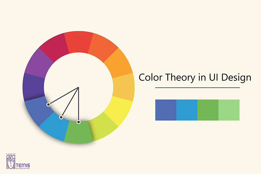
Color theory is the collection of rules and guidelines designers use to communicate with users through appealing color schemes in visual interfaces. To pick the best colors every time, designers use a color wheel and refer to extensive collected knowledge about human optical ability, psychology, culture, and more.
Modern color theory is largely based on Isaac Newton’s color wheel, which he created back in 1666.
What is a Color Wheel?
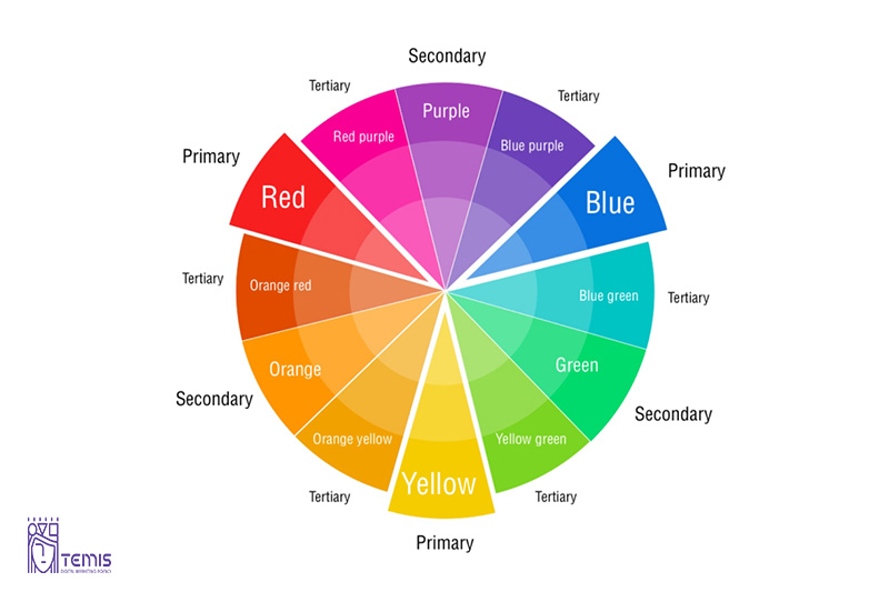
The basic color wheel displays three categories of color, a circle consisting of different colors; primary colors, secondary colors, and tertiary colors. Do you remember it? If you are, well done, you’ve already grasped the basics of color theory!
The primary is those three pigment colors that any combination of other colors can not form. By combining primary colors, we get the secondary ones, and the mix of the primary and secondary colors gives us the tertiary colors, usually with two-word names such as red-violet.
Designers can create custom color palettes using the color wheel. You should be familiar with the following three essential aspects of color: Value, Hue, and Saturation.
The effect of color harmony
The most important aspect of color theory is color harmony which refers to using color combinations that are visually pleasing to the human eye. Color palettes can promote contrast or symmetry, but until they make sense together, they can still produce a visually satisfying effect.
All designers try to gain color harmony when it comes to UI design. Color harmony engages the viewer and establishes a sense of order based on the psychological need for balance. A lack of harmony in a color palette can make an interface design boring, chaotic, and messy.
The Psychology of Color
The psychology of color and its psychological effects on users is complex and subjective. But certain aspects can be addressed on a universal level. Designers can easily learn the basics and apply them to their work. But there are finer points to be remembered when using colors in UX design.
Color models
The color has two different natures you need to know:
The tangible colors: which are the surface of objects
The others: are produced by light, such as the beams of TV.
These types create two color models:
- Additive
- subtractive
Additive color model
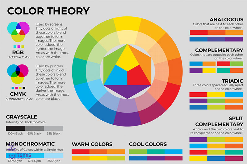
The additive color model includes red, blue, and green. It is also known as RBG. This color model is used to determine the colors on screens and displays. This system allows you to combine primary colors in equal amounts.
The result is secondary colors, cyan, magenta, and yellow. People often find the results of mixing additive colors counterintuitive. These are common to subtractive colors of paints and dyes, inks, as well as other tangible objects.
Subtractive color model
Subtractive color models are based on the subtraction of light. It is composed of two color systems.
RYB (red-yellow, blue): This system is used most often in art education, particularly painting.
CMY (cyan-magenta-yellow): RYB is the foundation of modern scientific color theory. It determined that cyan and magenta are the most effective combinations of the three colors. This is how the color model CMY was created. It was used mainly in printing. When photomechanical printing had black ink as the key component, it was referred to as CMYK (cyan, magenta, yellow, and black). Without this pigment, muddy brown would be the closest shade to black.
Color palettes
A color palette is a collection of colors that UI designers use when creating an interface. When used correctly, color palettes form your brand’s visual foundation, help maintain consistency, and make your user interface aesthetically pleasing and enjoyable.
What are color palettes types?
Colors can be combined to form one of five color palettes that UI designers commonly use.
- Complementary
- Split-complementary
- Analogous
- Monochromatic
- Triadic
- Tetradic
How do you choose a color palette?
Here are some things to remember when choosing the color scheme for your user interface.
- Research your audience to choose the right color
- Don’t skimp on contrast
- Use UI design color conventions
- Choose your colors wisely
- Consider color psychology
What are the best tools for choosing a color palette?
There are helpful tools and online color palette generators currently available to inspire you and help you to choose a color palette for your design.
Adobe Color
Adobe Color supports almost every color available. Comparable to other color generators. Adobe Colors has a color palette generator, which pulls colors from images you upload.
Adobe Illustrator
Adobe Illustrator Color Guide is a standout feature with its popular “color guide” feature. After you have chosen a color, the Color Guide will create a five-color palette.
Conclusion
To be a successful UI designer, you don’t have to be an expert in color theory. It isn’t easy to understand color theory. It is essential to grasp the basics. With this knowledge, you can create an effective design.
FAQ
What is Color Theory in UI design?
Color theory is the collection of rules and guidelines designers use to communicate with users through appealing color schemes in visual interfaces.
What is a Color Wheel?
The basic color wheel displays three categories of color, a circle consisting of different color’s; primary color’s, secondary color’s, and tertiary colors.
How do you choose a color palette?
Here are some things to remember when choosing the color scheme for your user interface.
- Research your audience to choose the right color
- Don’t skimp on contrast
- Use UI design color conventions
- Choose your colors wisely
- Consider color psychology


